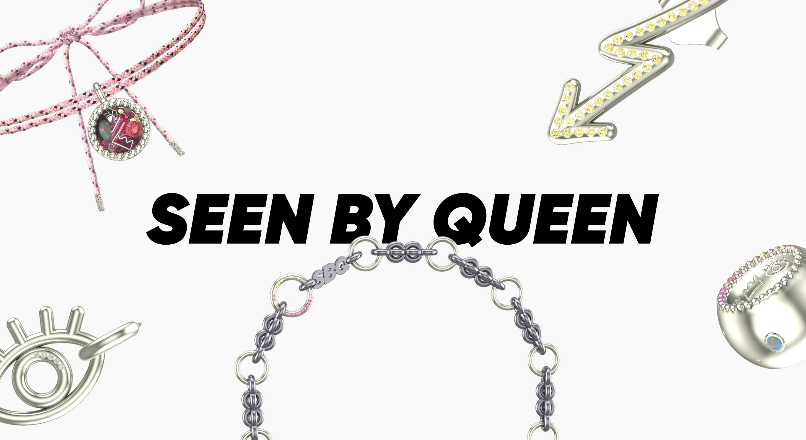
Seen by queen
intro
SBQ is a Czech-born jewelry brand redefining what luxury looks like in Italy. Built on bold, modular design, it rejects clichés of perfection and polish. Instead, it treats jewelry as modern armor. A way for women to lead, protect, and express themselves without apology.
project overview
client
seen by queen
category
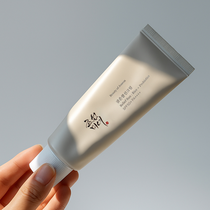
luxury jewelry
year
2025
solution
the intense brand™
services
vibe-driven™ strategy, social media, user-generated content
target market
italy
The CHALLENGE
SBQ had the look. Bold jewelry and design language that turned heads. But it lacked a backbone. No positioning. No voice. No content system. Preparing for the Italian market and Milano Jewelry Week, the brand needed clarity to compete. And connect to women who don’t hide in luxury. But claim their space in it.
the solution
This was never going to be classic jewelry communication. No romance. No fashion fluff. SBQ needed a tone that was sharp but human. A strategy that could carry irony, emotion, and edge. So we built everything from scratch: brand strategy, tone of voice, messaging, social media strategy, and structure. We gave SBQ the words, the rhythm, and the system to speak with clarity.
service 1
vibe-driven™ strategy
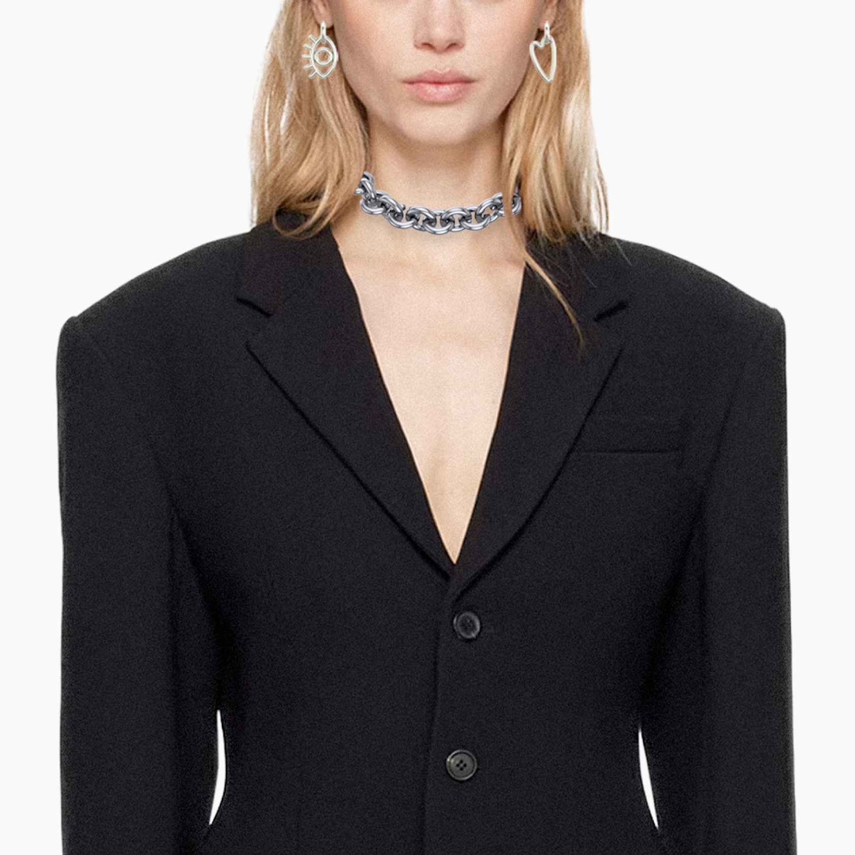
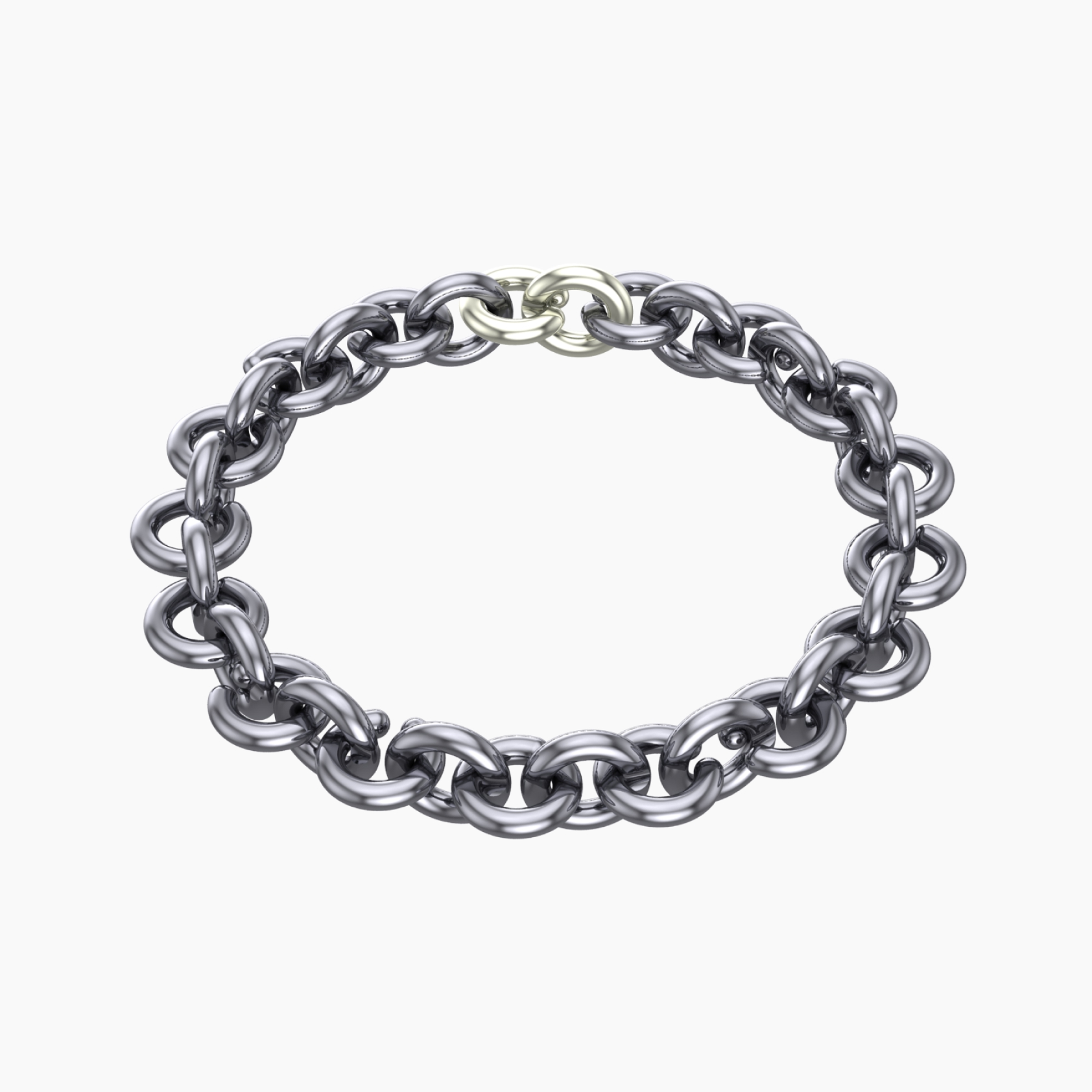
SBQ wasn’t here to be pretty. It was created for women who don’t wear jewelry to be noticed. They wear it because they already are.
Our task was to turn that into a strategy. We positioned SBQ as modern armor for real life, for the days you lead and the days you barely make it through. Not about perfection, but about presence. Precise in form, emotional in meaning, unapologetically bold.
Our task was to turn that into a strategy. We positioned SBQ as modern armor for real life, for the days you lead and the days you barely make it through. Not about perfection, but about presence. Precise in form, emotional in meaning, unapologetically bold.
tone of voice
SBQ needed a voice that could carry irony, emotion, and sharp truths. Without flinching. So we gave it one: bold, clear, unapologetic. A voice that says more in one line than most say in ten. Built to last. Built to cut through. It sounds like a woman who’s been through it all. And only speaks when it matters. Built for an international stage from day one.
brand vibe
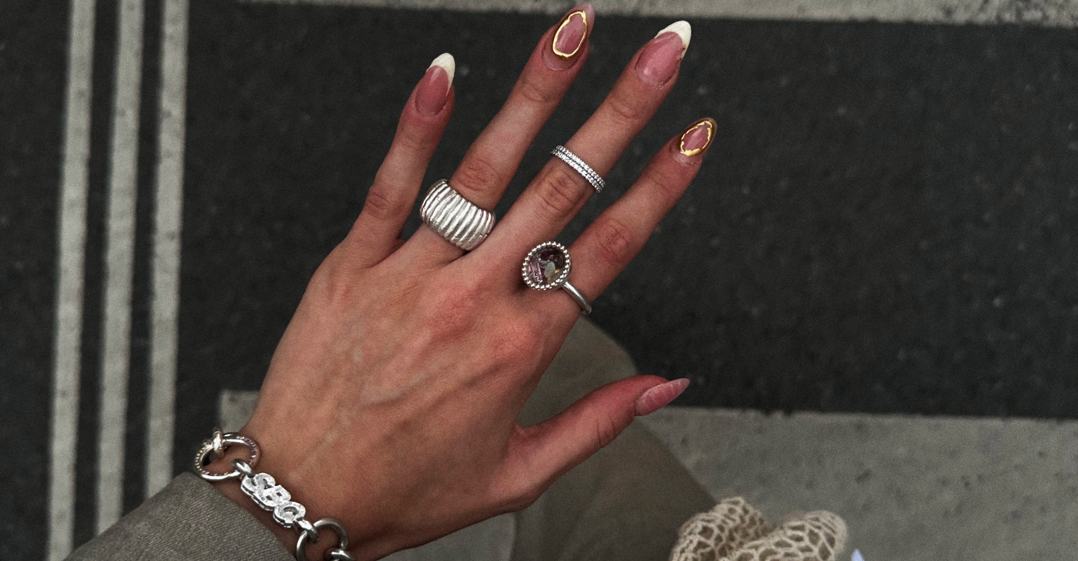
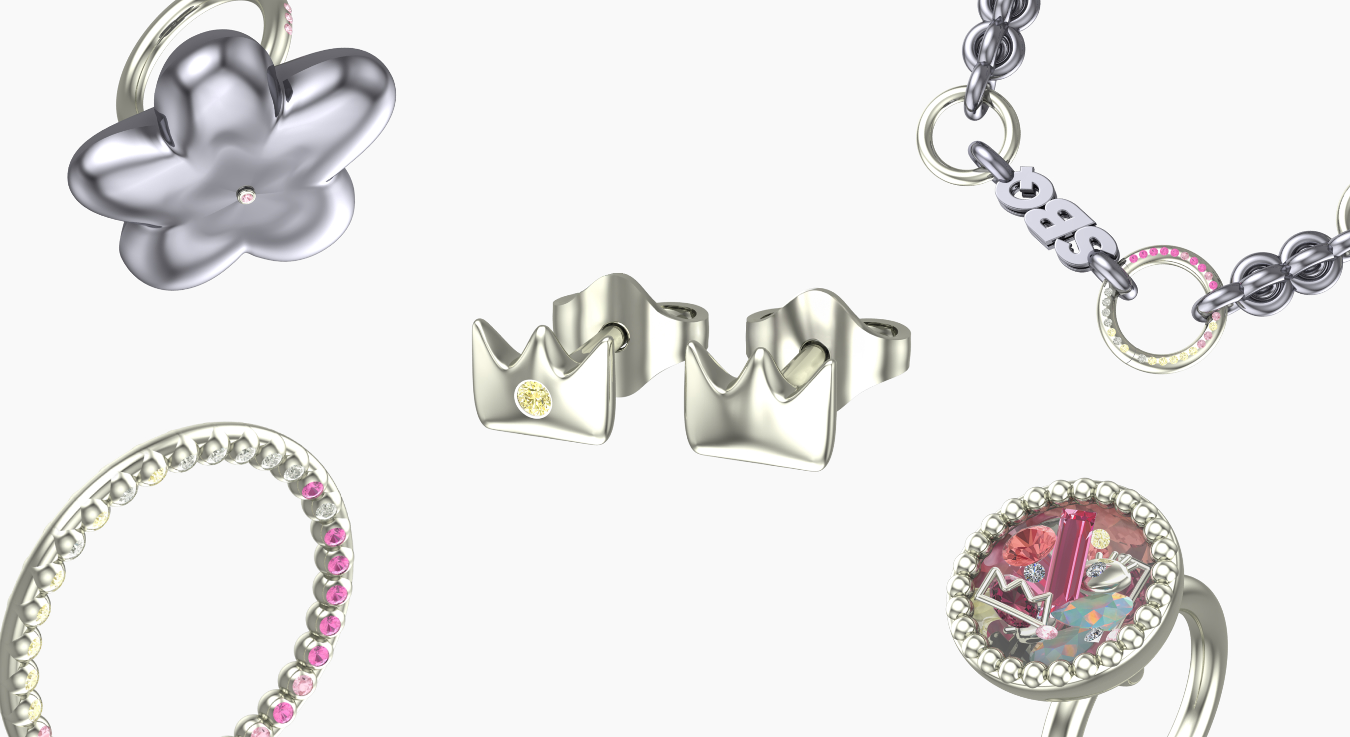
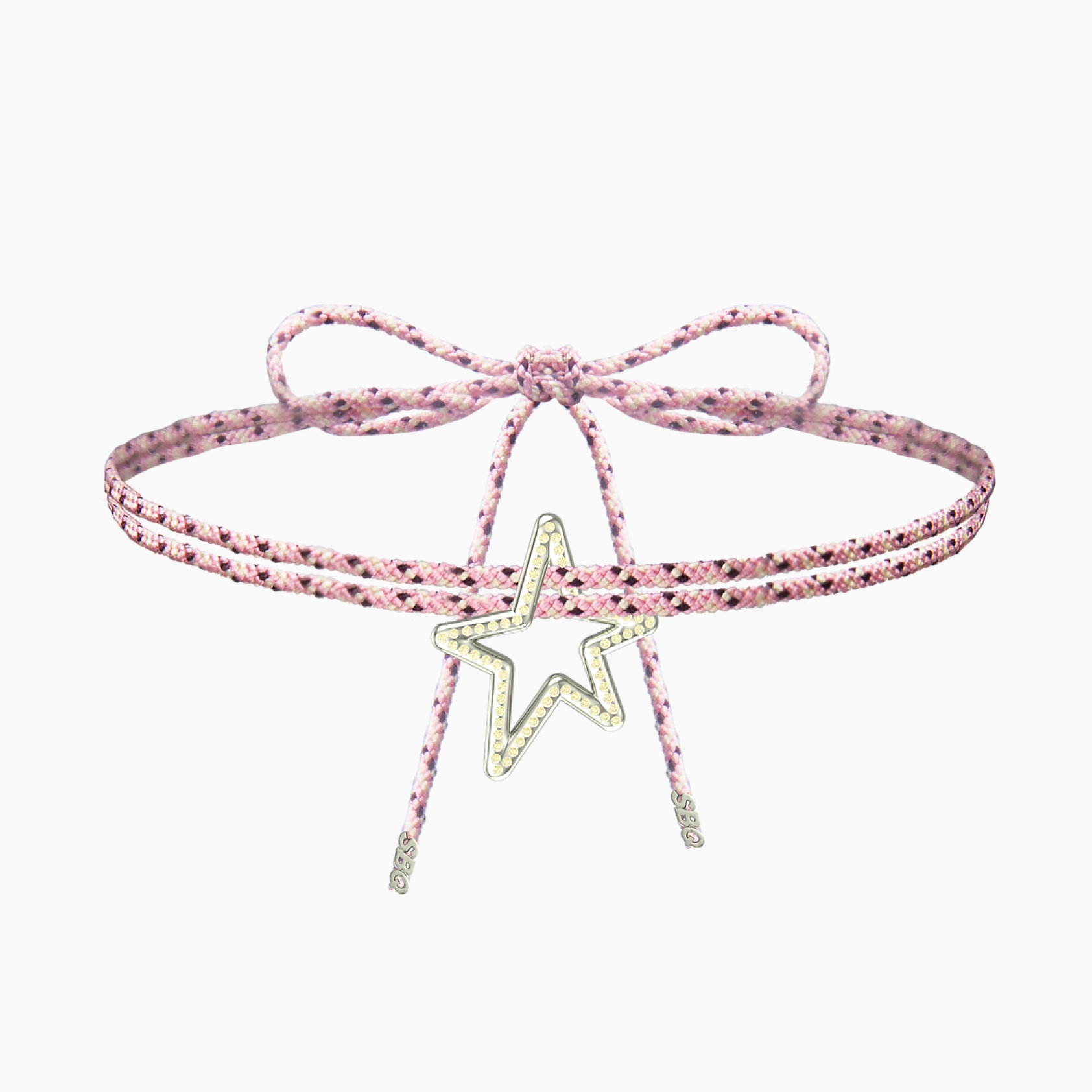
SBQ is a brand that walks into spaces that take themselves too seriously and breaks them with style. We built the entire vibe on contrast: technically perfect jewelry set in chaotic, playful, glitchy, and raw environments.
SBQ doesn’t try to fit in. It stands out. Deliberately, even disruptively. And that’s exactly what makes it magnetic. Its vibe is unpredictable, yet precisely constructed. A style that refuses to conform. And an authenticity that has no need to be perfect.
SBQ doesn’t try to fit in. It stands out. Deliberately, even disruptively. And that’s exactly what makes it magnetic. Its vibe is unpredictable, yet precisely constructed. A style that refuses to conform. And an authenticity that has no need to be perfect.
competitor analysis
We started with a deep dive into the landscape. Mapping key players, dissecting content, and running a full audit. Most brands whispered, polished to perfection, trying to please. SBQ came to challenge them. With edges, contradictions and attitude. Where others went soft, we went sharp. SBQ isn’t part of the category. It’s rewriting its tone.
persona analysis
We focused on personas' states of mind. How these women move through the world and life.
One persona craves jewelry that fits both calendar and character. Another collects moments and statement pieces, setting the energy rather than following it. A third focuses only on what matters and invests when it’s truly worth the time.
Each of them wears jewelry for a reason. And we built a brand that speaks to all three. With clarity, confidence, and zero compromise.

service 2
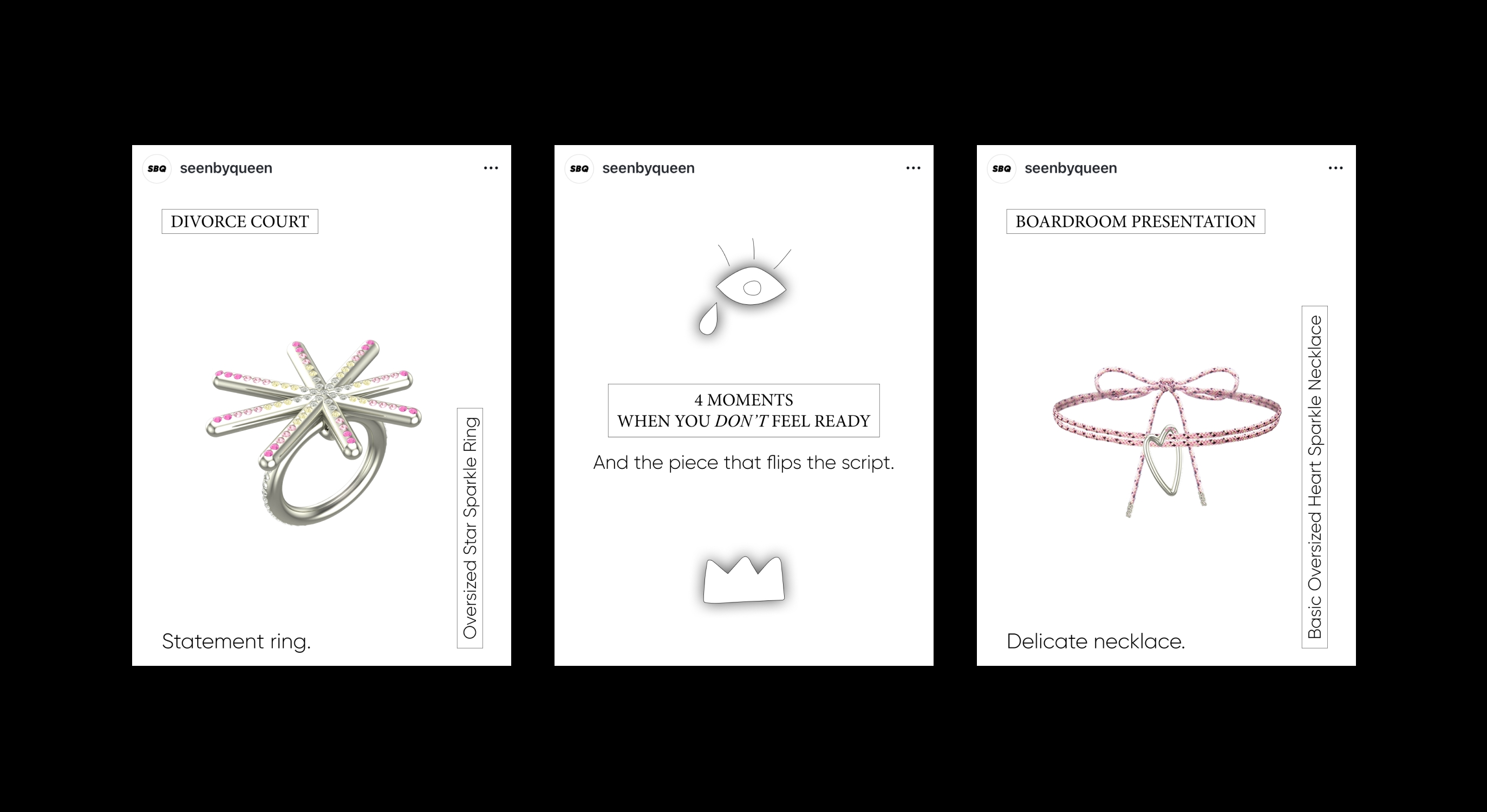
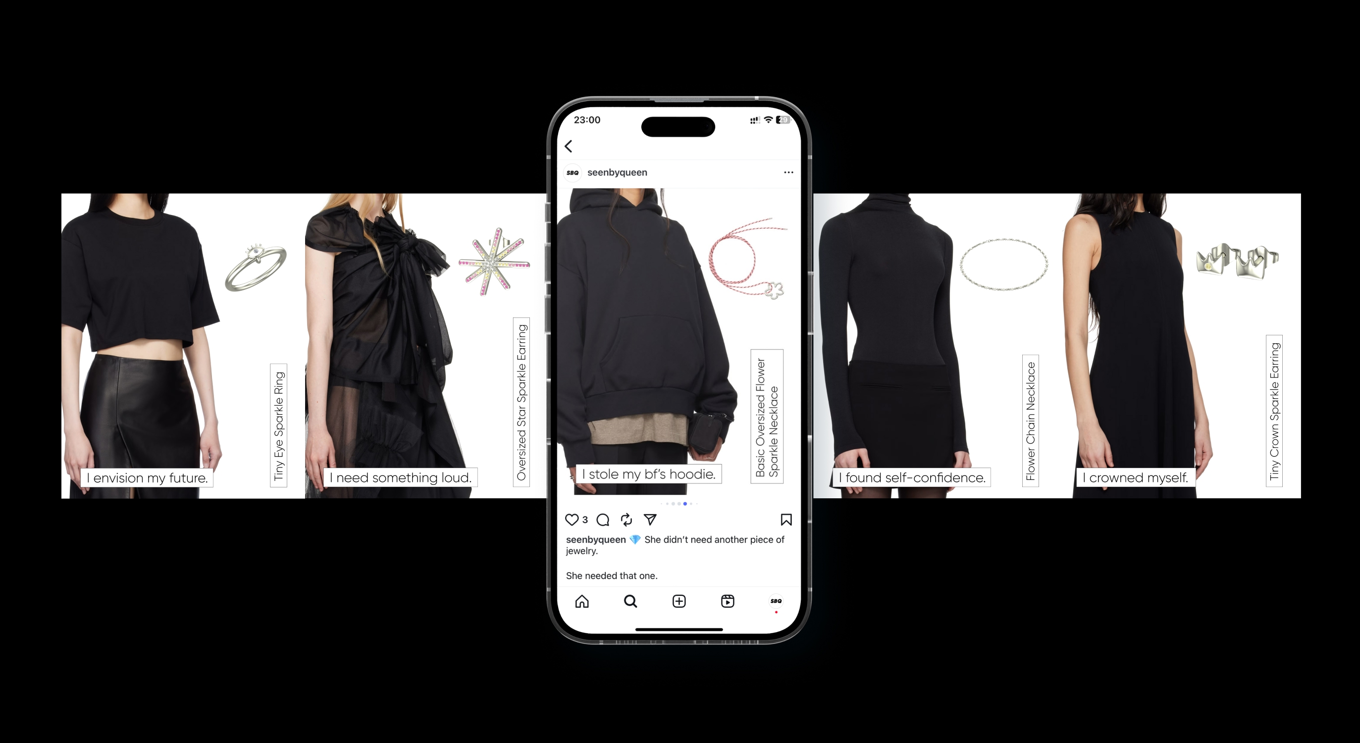
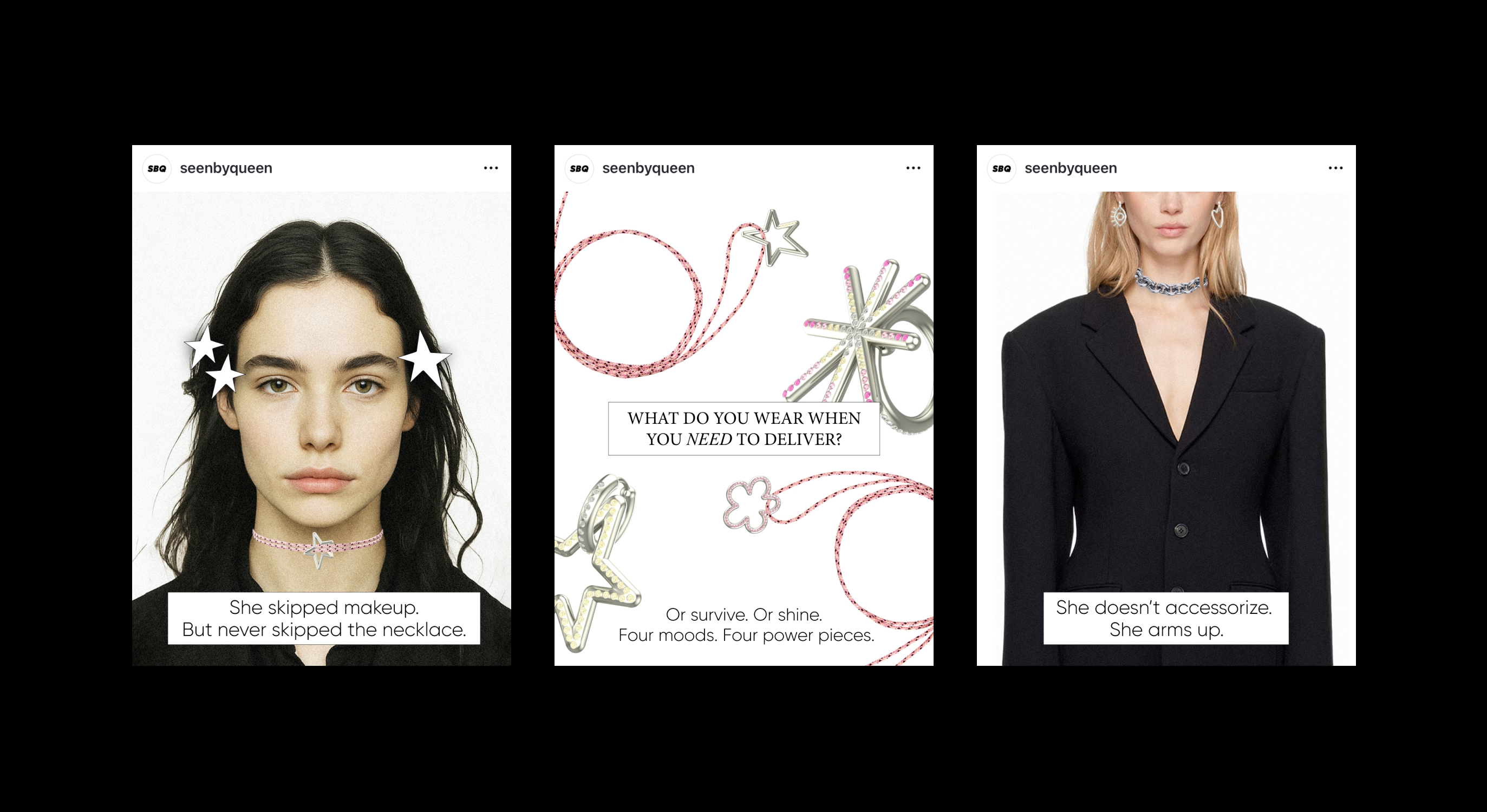
SOCIAL MEDIA
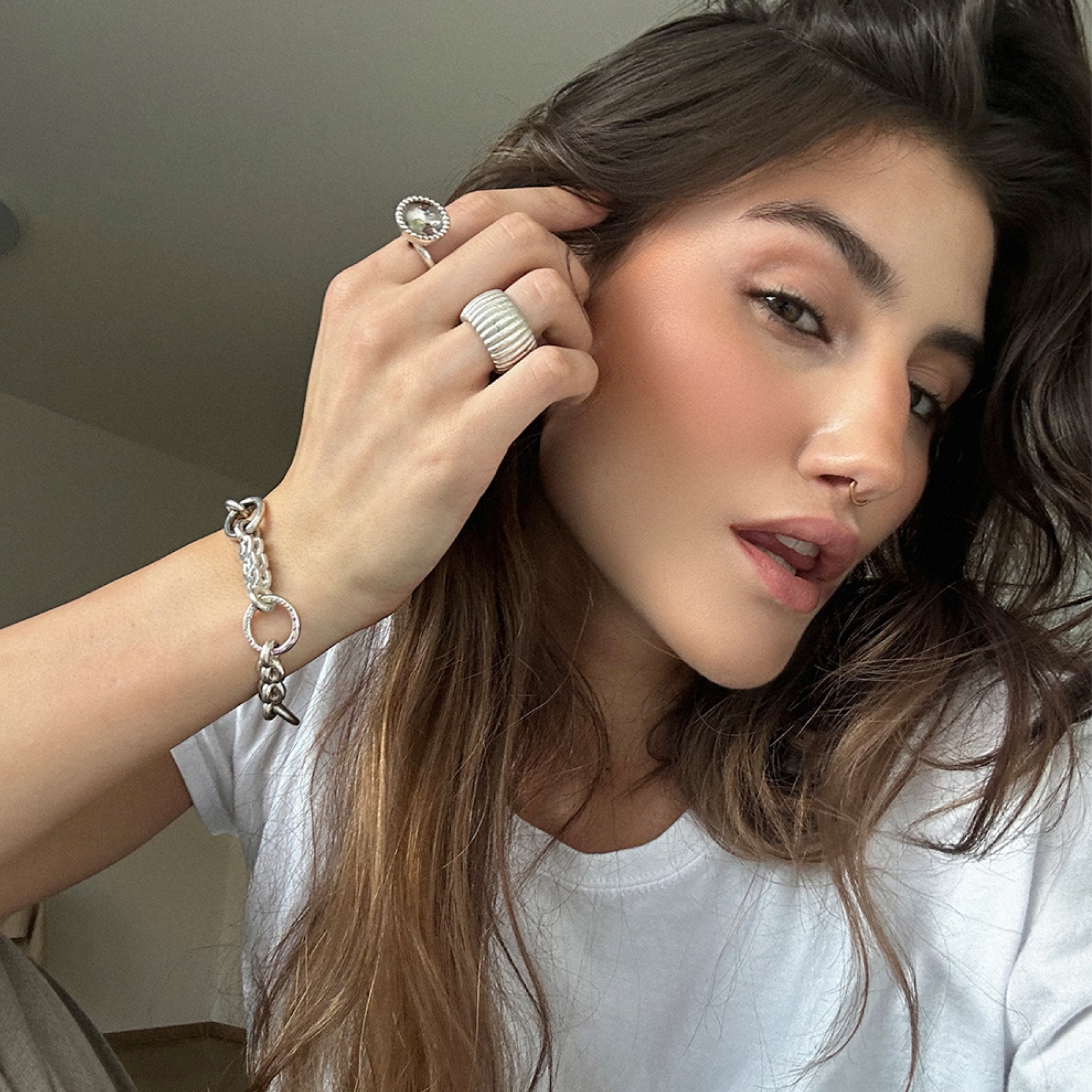
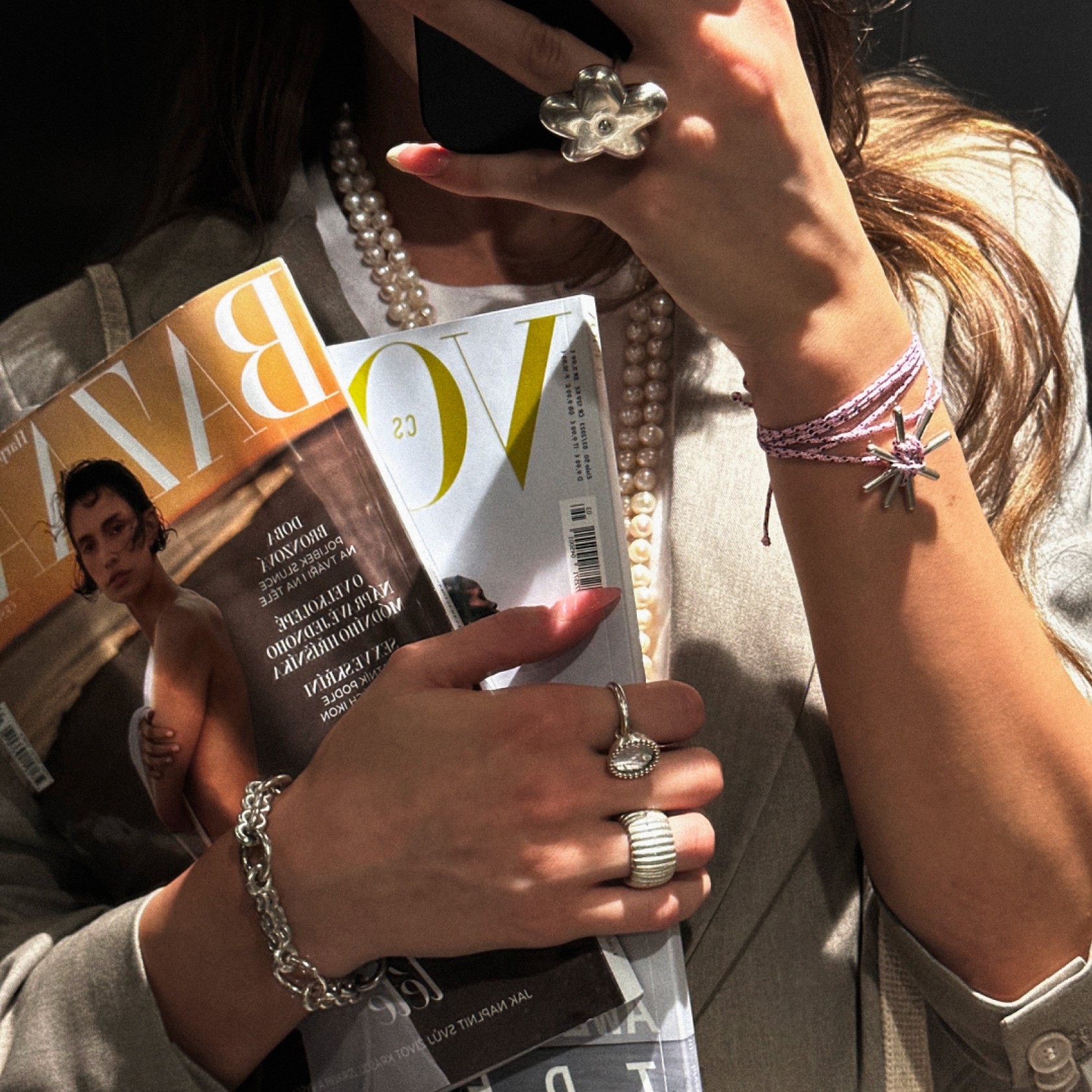
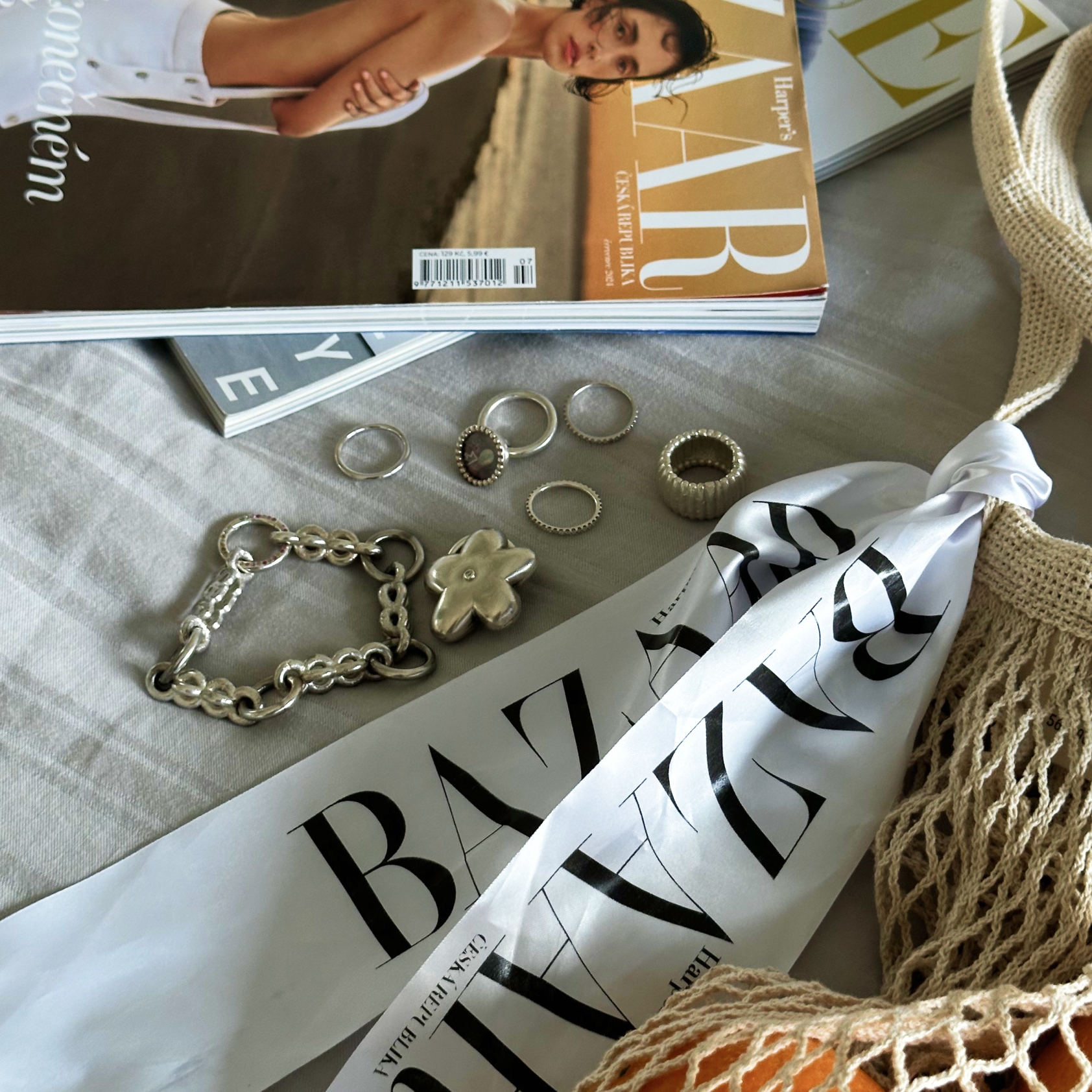
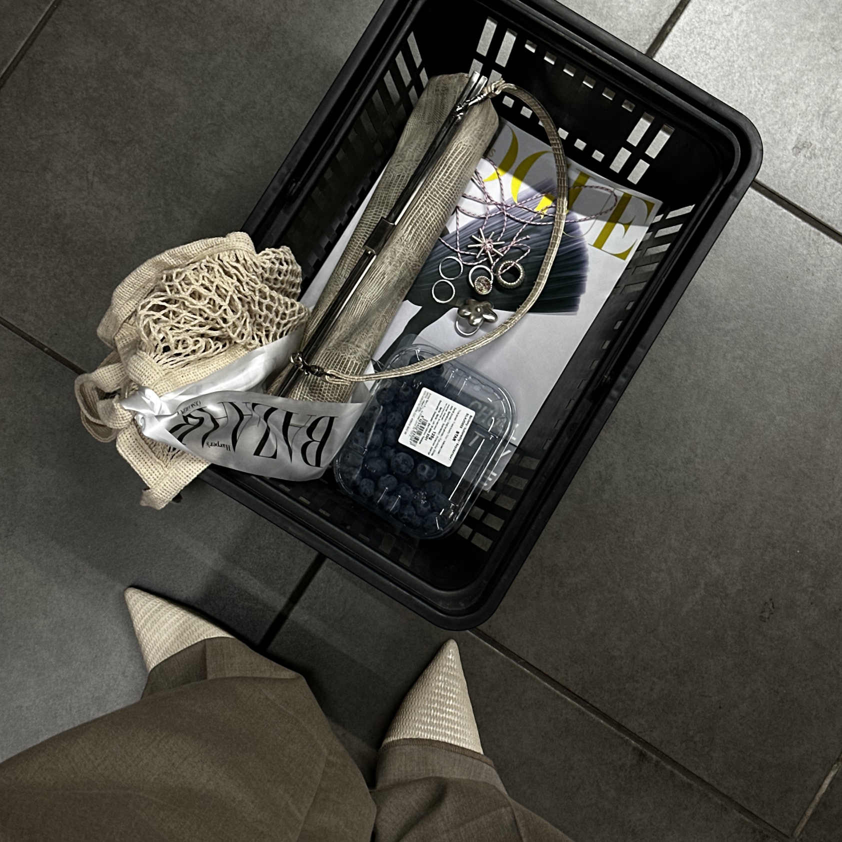
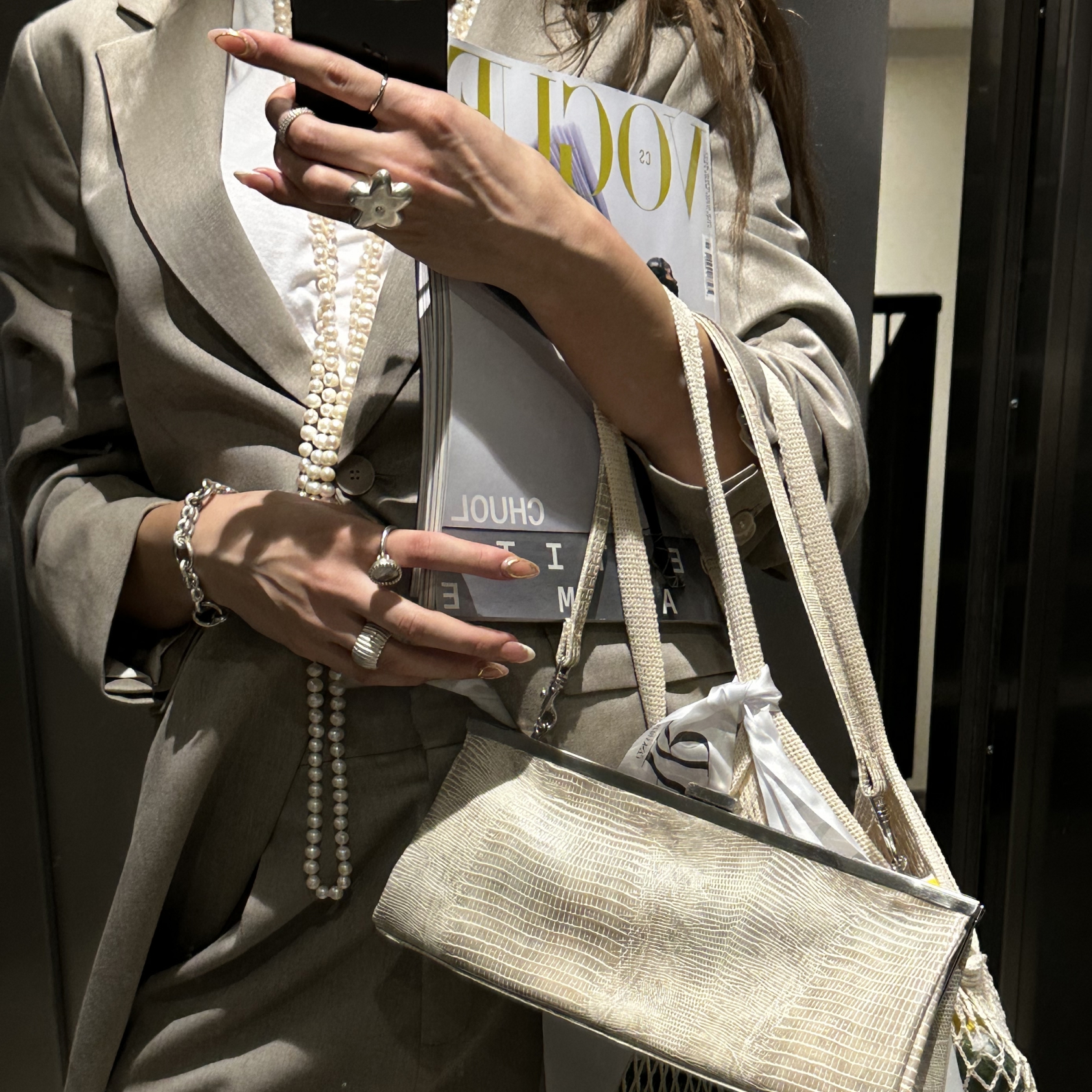
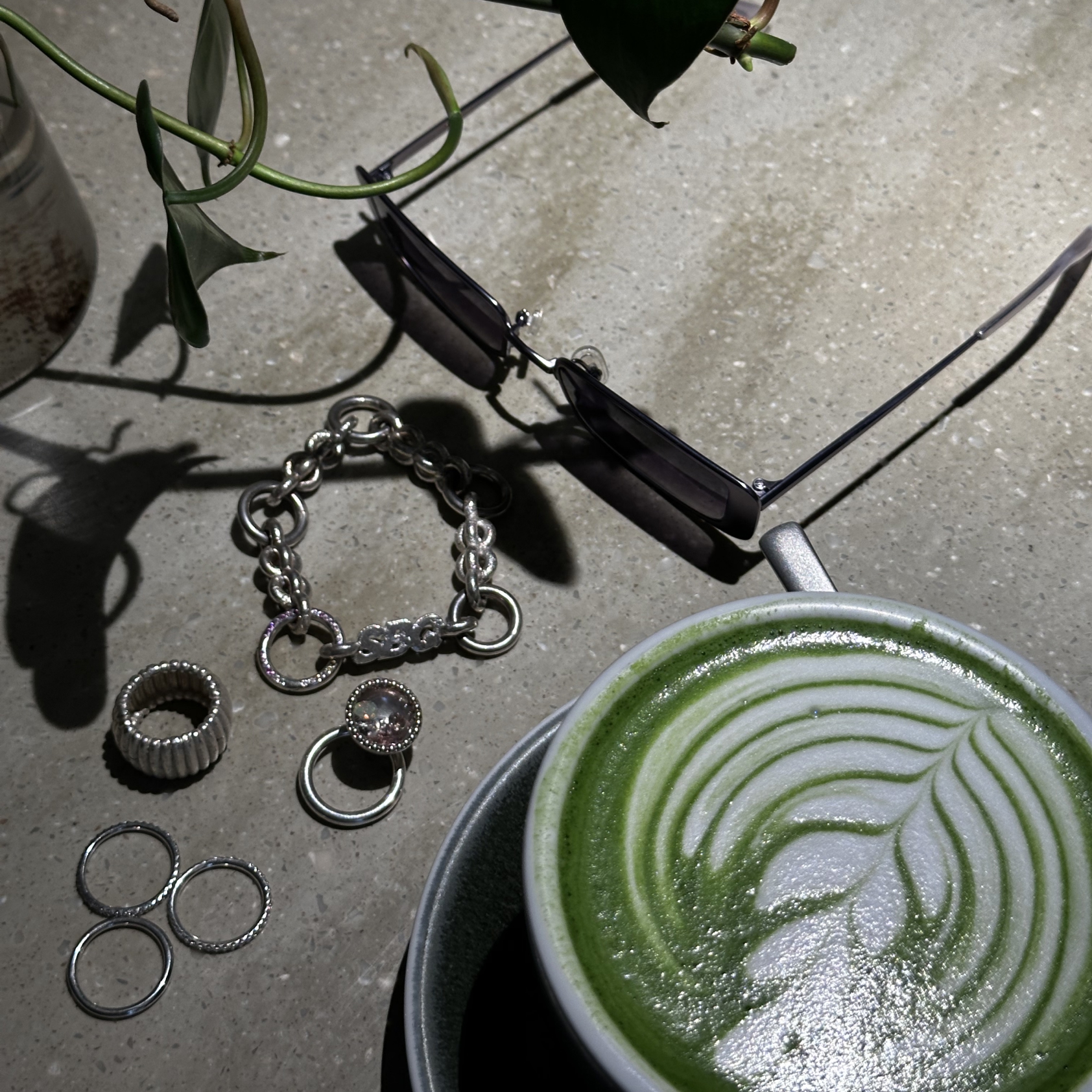
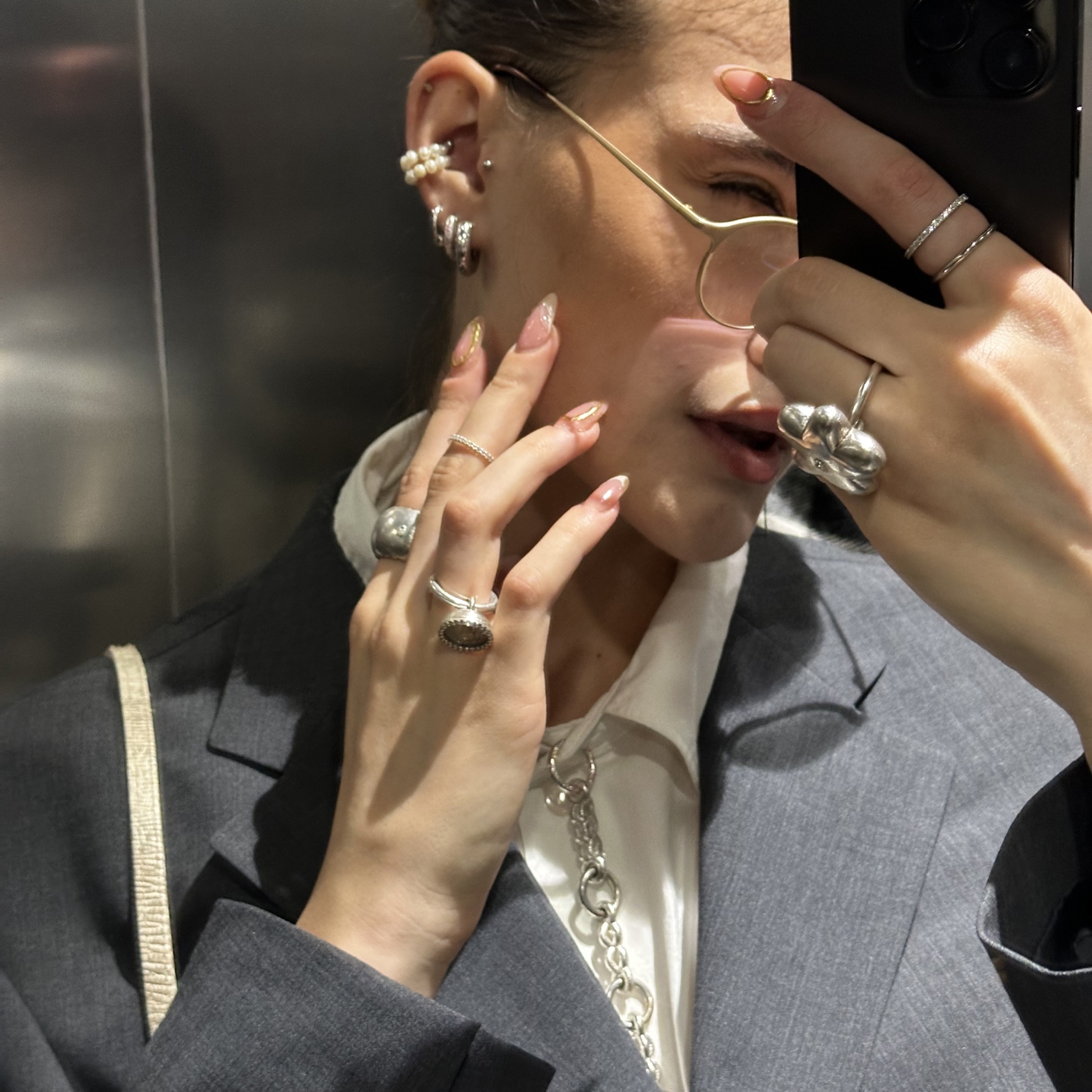
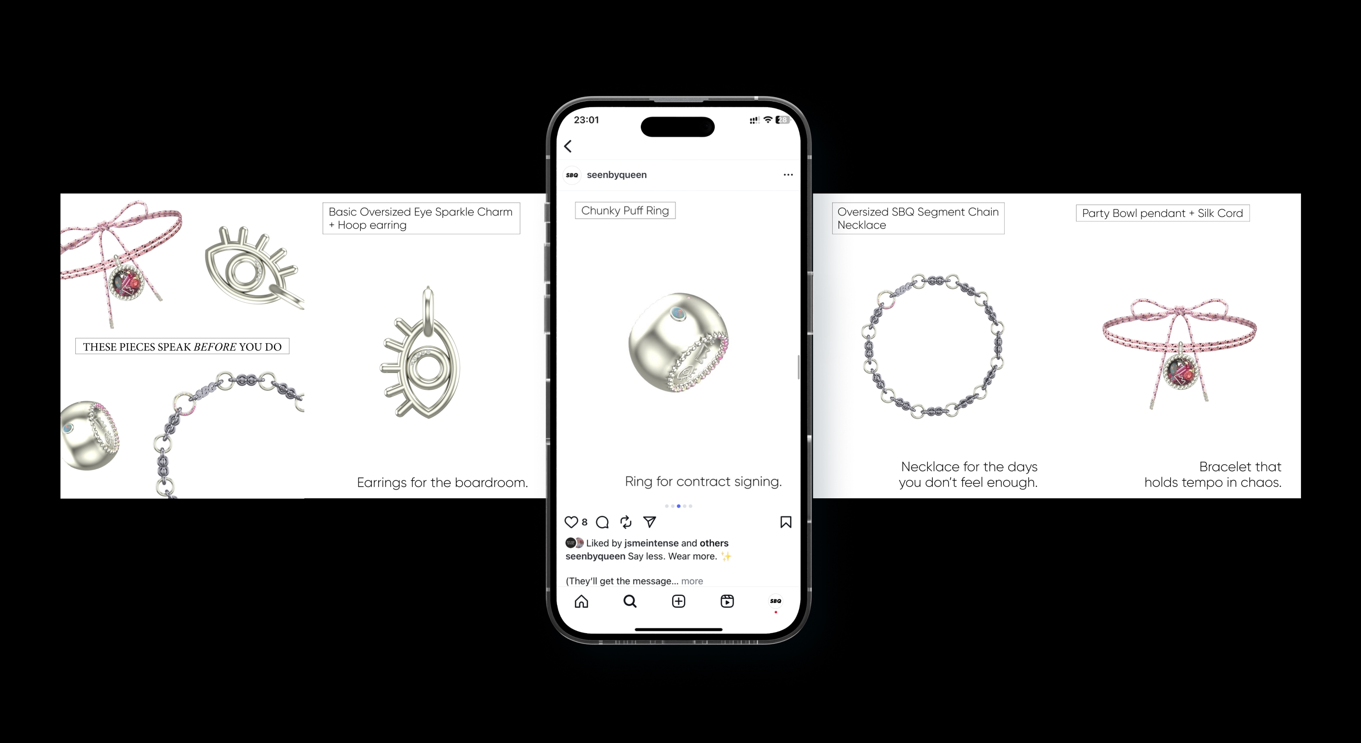
Most jewelry brands post beauty. SBQ posts truth. We turned Instagram into a visual diary. Raw, emotional, sharp. Reels captured tension. Carousels spoke in punchlines. Stories showed the mess behind the magic. We mixed what usually doesn’t mix: UGC, raw BTS, chaos and clarity, rings and divorces.
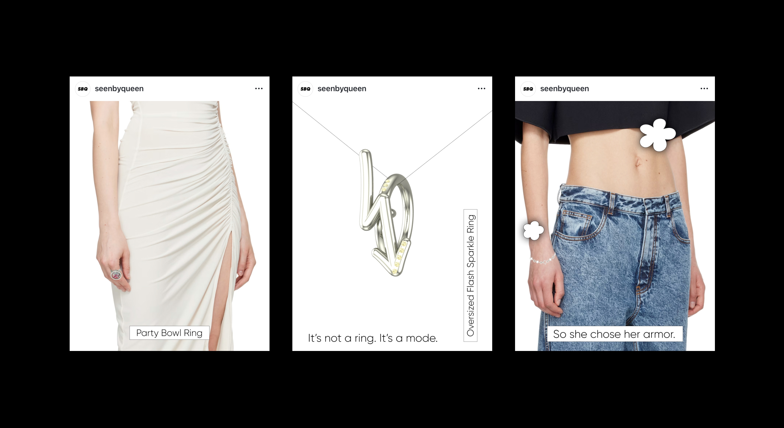
posts
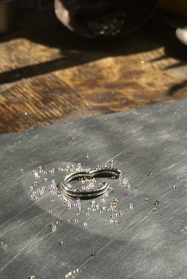
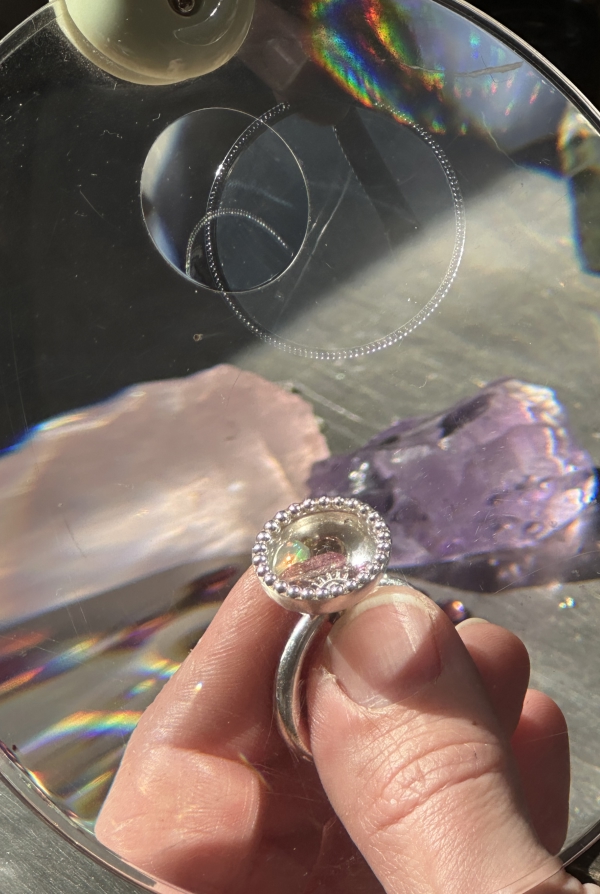
Every post had a role. Not just to show jewelry, but to hold space and spark emotions. Alongside high-craft visuals, we wove in raw intimacy and topics like mental health, showing that true luxury also carries vulnerability. The feed became more than a grid: it was a feeling, a mirror, a quiet punchline.
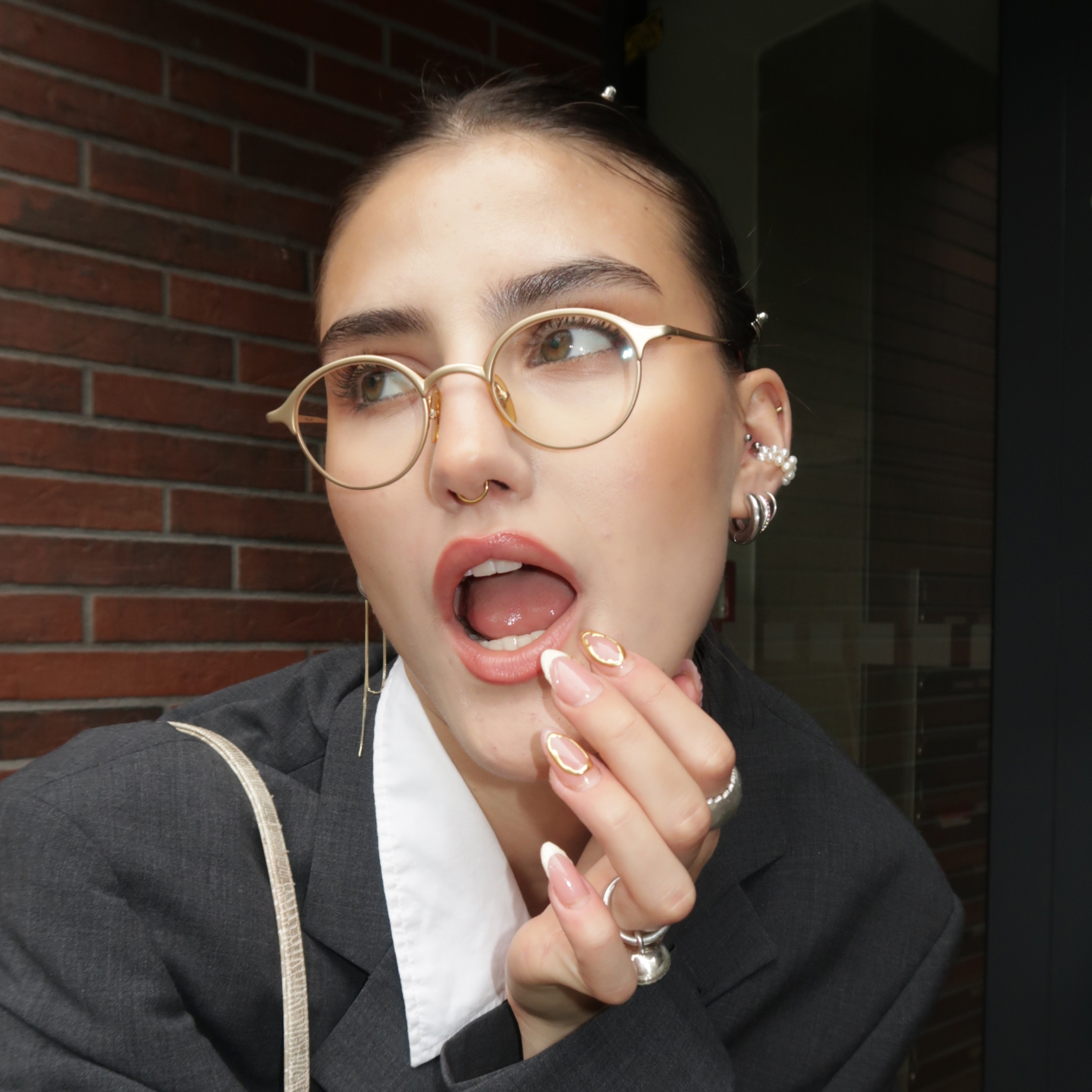
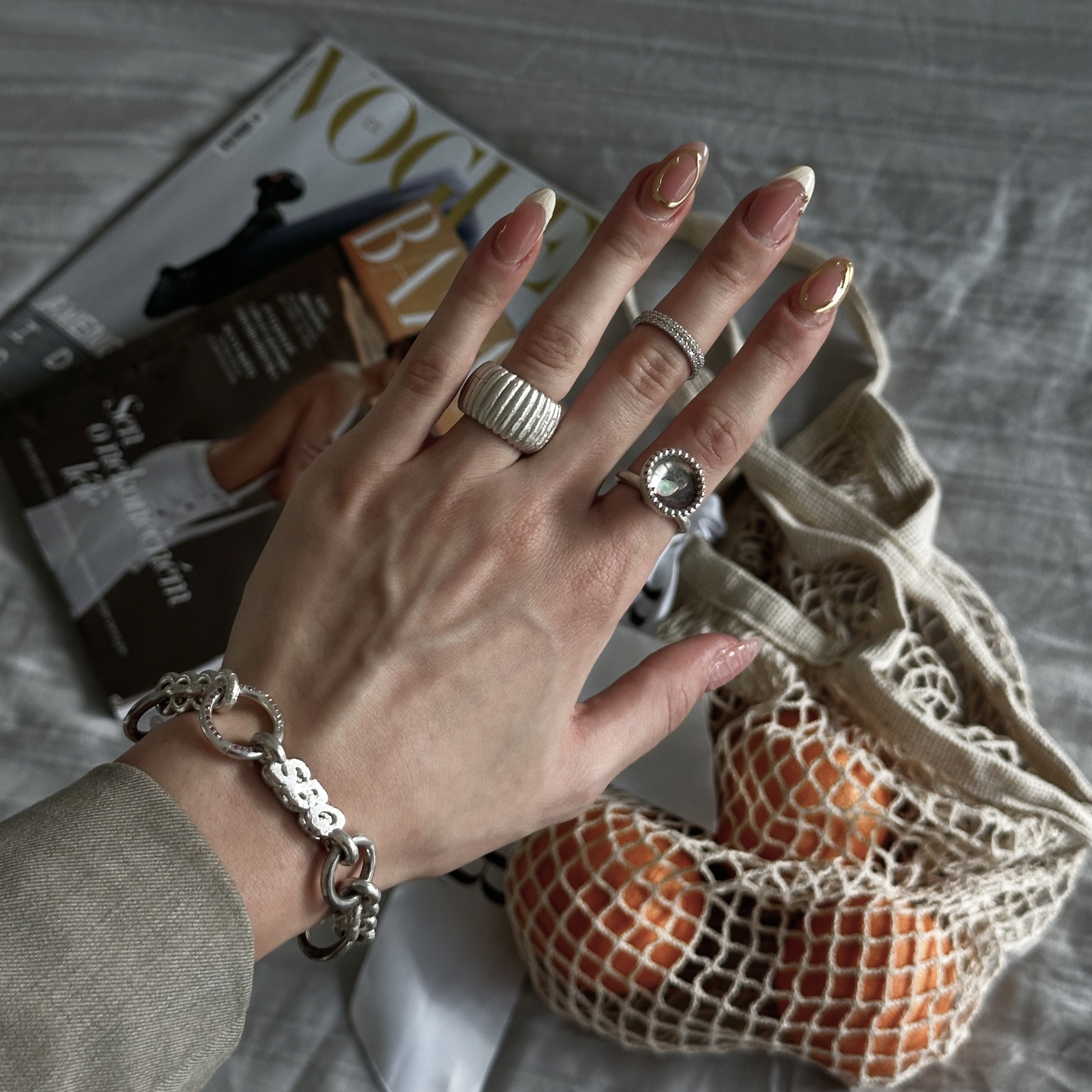
REELS
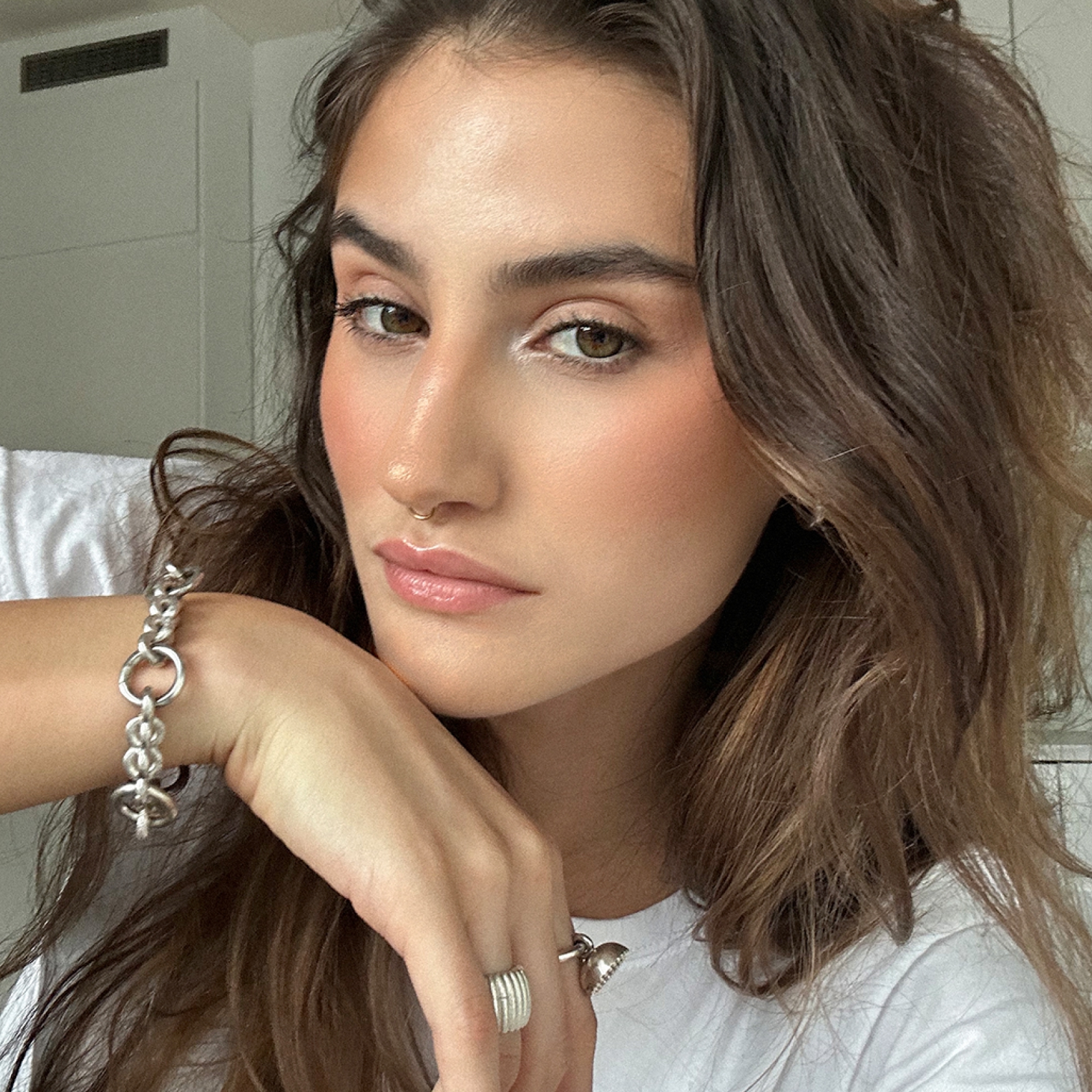
Reels are declarations. Captured on iPhones, in mirrors, in motion. Mostly UGC. Raw, instinctive, imperfect by design. You heard metal. You felt tension. Jewelry shown not on pedestals, but in real moments. Crafted pieces with unfiltered life. Because real luxury doesn’t whisper. It resonates.
stories
A mix of chaos and clarity. Preorder drops in real-time, behind-the-scenes that didn’t hide the mess. We showed raw light, shaky hands, half-packed boxes. Not to impress, but to include. Because when a brand opens the door, it builds more than hype. It builds trust.
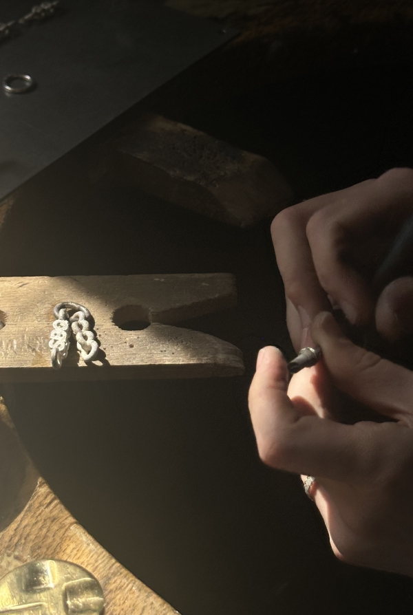
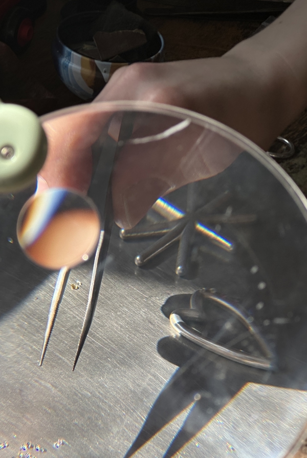
user-generated content
We used UGC to strip away polish and show jewelry in raw, unfiltered moments. In mirrors, on phones, in motion. Real life gave the brand authenticity and tension no campaign could fake.
the OUTCOME
This short-term collaboration gave SBQ exactly what it needed: a backbone. In weeks, scattered ideas became a clear identity and system. Modern armor with presence, a voice that cuts through, and a vibe built on contrast. A foundation the brand can now grow from with confidence and edge.
the OUTCOME
Clarity
in strategy and content system
Vibe
contrast, chaos, precision
Voice
bold, sharp, unapologetic
Presence
built for Milan and beyond
testimonial
“Before, everything felt a bit all over the place. After working with Intense Social, we finally had a clear direction! Who we are, how we speak, and how our content and visuals fit together. It gave us a solid base to build on, and we feet truly ready for our launch in Milan. It moved us forward in a big way.”